
Creating Stunning Logos With Typography in Graphic Design
A logo is a reflection of a company’s brand. It is not just a design but a visual representation of the brand. In addition to serving as a customer’s first impression of a business, a logo can also influence how they perceive it. It captures the essence of your brand, and it tells people what your brand stands for. A logo that lacks personality will surely leave a lot to be desired. Additionally, typography in graphic design has a significant impact on how customers view brands.
So, let’s dig deeper into creating stunning logos with typography in graphic design by following some tips to make your logo stand out.
What Is Typography in Graphic Design?
Typography is derived from the Greek words τύπος (typos) meaning “form” or “impression” and γράφειν (graphein) which means “to write”.
The term ‘typography’ is often associated with typeface design and selection as well.
Yet, it is much more than these two aspects. It includes elements like lettering, symbols, grids, headers, footers, etc. As a whole, typography in graphic design involves arranging a type in a particular way. (Type refers to the appearance or style of text)
Typography can be considered a combination of art and science because it involves understanding typefaces and how to use them effectively for branding messages.
The Importance Of Typography In Graphic Design
- Typography is the backbone of graphic design. It is the art of arranging type in a visually pleasing and readable way.
- Effective typography has the power to transform a design from ordinary to extraordinary. It not only helps to communicate the intended message but also creates a memorable and immersive experience for the viewer.
- In graphic design, typography serves as a visual guide that directs the viewer’s attention and guides them through the design.
- By carefully selecting typefaces, fonts, and styles, designers can convey different emotions, evoke specific moods, and create a cohesive visual language that aligns with the brand’s identity.
- Typography also plays a crucial role in establishing hierarchy and organizing information.
- By varying the size, weight, and style of the type, designers can emphasize important elements, create visual interest, and ensure that the message is easily digestible for the viewer.
- In short, typography is not just about selecting fonts; it is about creating an immersive visual experience that effectively communicates the intended message.
Typography Principles for Effective Designing
To create effective typography, it is important to follow certain principles and guidelines. These guidelines ensure that the typography is visually appealing, readable, and communicates the intended message effectively.
- Alignment: One of the fundamental principles of typography is alignment. Aligning the type elements helps to create a sense of order and harmony in the design. Whether it’s left-aligned, right-aligned, centered, or justified, the alignment should be consistent throughout the design.
- Hierarchy: Another important principle is hierarchy. Hierarchy refers to the organization of information based on its importance. By using different sizes, weights, and styles, designers can establish a clear hierarchy and guide the viewer’s eye through the design. It is crucial to prioritize the most important information and make it stand out.
- Spacing: Spacing both between letters (tracking) and between lines (leading), is another essential aspect of typography. Proper spacing ensures legibility and readability by creating enough breathing space for the letters and lines. It also helps to establish a sense of rhythm and balance in the design.
- Color: By using contrasting colors, designers can create emphasis and highlight important information. It is important to ensure that the color choices are legible and accessible for all viewers.
Elements Of Typography – Typefaces, Fonts, and Styles
Typography encompasses various elements that work together to create a visually appealing design. The choice of typefaces, fonts, and styles can greatly impact the overall look and feel of a design.
- Typefaces: Typefaces are a collection of fonts that share a similar design. They can be categorized into different styles such as serif, sans-serif, script, and display. Each style has its unique characteristics and can evoke different emotions. For example, serif typefaces are often associated with tradition and elegance, while sans-serif typefaces are known for their simplicity and modernity.
- Fonts: On the other hand, refer to the specific variations within a typeface. They include different weights, such as regular, bold, and italic, as well as variations like condensed and extended. Each font variation adds a distinct personality to the design and can be used to create emphasis or contrast.
- Styles: When selecting typefaces and fonts, it is important to consider legibility and readability. Legibility refers to how easily the type can be recognized, while readability refers to how easily the type can be read and understood. It is crucial to choose typefaces and fonts that are appropriate for the intended audience and purpose of the design.
The Role Of Hierarchy And Spacing In Typography
Hierarchy and spacing are two crucial aspects of typography that play a significant role in enhancing visual communication.
Hierarchy refers to the organization of information based on its importance. By establishing a clear hierarchy, designers can guide the viewer’s eye through the design and ensure that the most important information stands out. This can be achieved by using different sizes, weights, and styles for the type.
Spacing, on the other hand, refers to the amount of space between letters (tracking) and between lines (leading). Proper spacing is crucial for legibility and readability. It helps to create enough breathing space for the letters and lines, making the text easier to read.
In addition to legibility, spacing also plays a role in establishing a sense of rhythm and balance in the design. By adjusting the spacing between letters and lines, designers can create visual interest and ensure that the text flows smoothly.
Overall, hierarchy and spacing are essential tools that designers can utilize to enhance visual communication and create designs that are both aesthetically pleasing and easy to read.
Incorporating Typography Trends In Graphic Design
Like any other design element, typography is subject to trends. Design trends can be influenced by cultural, technological, and artistic developments, and they can greatly impact the way typography is used in graphic design.
- One current typography trend is the use of bold and oversized type. This trend emphasizes the importance of the message by making it impossible to ignore. It can be particularly effective for headlines and call-to-action elements.
- Another trend is the use of custom and hand-drawn typefaces. These unique and personalized typefaces add a sense of authenticity and craftsmanship to the design. They can help to create a more personalized and intimate connection with the audience.
- Minimalism is also a popular trend in typography. Minimalist typography focuses on simplicity and clarity, using clean and open typefaces with ample white space. This trend is often associated with modern and sleek designs.
- It is important to note that while trends can be a source of inspiration, they should not dictate the design choices. It is crucial to consider the context, purpose, and audience of the design when incorporating typography trends.
Tips For Creating Stunning Logos With Typography
While logo design is an art form in itself, creating it with the correct typography in graphic design is also an excellent opportunity to showcase your creative side and add an extra dimension to your brand. We have compiled some tips that will help you design an impactful logo using topography that is unique.
1. Understand Your Brand
It is essential to understand the core of your brand and use that to determine the overall feel of your logo. Start with understanding what message your brand wants to convey. Also, considering what values it drives to the customers is equally important.
Further, you can choose an icon or illustration that best represents your brand. After you have selected the right illustration, it is time to design a logo that is memorable and eye-catching.
Colors, layouts, fonts, and shapes all play a critical role in making in a graphic design typographic logo stand out. It is important to ensure that the typographic logo accurately conveys your brand message.
2. Know Your Audience
This step is yet crucially important. What you want to communicate through your brand’s logo and what your audience anticipates can sometimes be very different things.
It is a good strategy to understand both your audience and your brand to design a typographic logo. Comprehend the goals of your target audience. Know who exactly your audience is and what are their demographics such as age, location, gender, and so on.
Further, try to figure out where can they find you and where will they see your logo such as billboards, websites, banners, and so on.
Lastly, analyze how well can your audience understand your brand’s message when they see your logo.
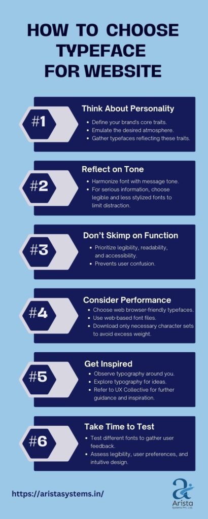
3. Choose Your Typeface Carefully
When choosing the right typeface for a logo, it’s important to understand the tone and style of the typeface. It should match the desired aesthetic of the logo.
It is also essential to explore interesting letter combinations to create unique logos. An effective logo design incorporates typeface and any icon or visual element incorporated into the design.
For instance, in creating a logo for a restaurant, you could incorporate images of food or drink as well as a serving utensil into the design. Additionally, when choosing typography for a company, it’s important to consider its personality and brand identity.
This can be done by exploring different font sizes, color schemes, and styles to create a visually appealing logo.
4. Explore Different Letter Combinations
When creating a logo, it is essential to consider typography and icon options. Besides this, exploring different letter combinations is also an effective idea.
When searching for serendipitous letter combinations, it is important to look at typesetting styles and fonts used in various logos. This can help create a unique logo design that stands out from the crowd.
One great example of this is the logo for FedEx, which includes an arrow hidden within the ‘e’ and ‘x’ characters.
Another option is to incorporate monograms into your logo design, which can give it a striking look with the style of any typeface incorporated into the logo.
5. Choose The Right Colors And Tones
When choosing the right colors for your logo, you can consider over 50 logo color combinations for inspiration. This will help you decide on the right colors that suit your brand identity and market your brand’s image.
You can also look at Disney’s logo as an example of a hand-lettered style with thick, bold letters and simple coloring. Another option is to use a range of lowercase and uppercase letters to make it appealing.
Finally, typographic logos can be enhanced with the right colors that play off their unique lettering or complement their design.
Tools and resources for exploring and experimenting with typography
Exploring and experimenting with typography is an essential part of the design process. There are a variety of tools and resources available that can help designers in their typography journey.
- Typography software, such as Adobe InDesign and Adobe Illustrator, provide a wide range of typefaces and fonts to choose from. These software also offer advanced typographic features, such as kerning and tracking adjustments, that allow designers to fine-tune the typography.
- Online platforms, such as Google Fonts and Adobe Fonts, offer a vast library of free and paid typefaces that can be easily accessed and integrated into designs. These platforms also provide helpful information about each typeface, including its characteristics, recommended usage, and licensing.
- Typography books and blogs are also valuable resources for designers who want to deepen their understanding of typography. They offer insights into the history, theory, and best practices of typography. Some recommended books include “The Elements of Typographic Style” by Robert Bringhurst and “Thinking with Type” by Ellen Lupton.
- Workshops and conferences focused on typography can provide designers with hands-on experience and opportunities to learn from industry experts. These events often include presentations, discussions, and practical exercises that can help designers sharpen their typography skills.
Bottom Line
Logo typography is an integral part of a brand’s identity. It helps convey the brand’s message and can help build loyalty and trust among its audiences.
The right typeface can support visual communication, making the logo more memorable and easily understood. When choosing a typeface for a logo, it’s important to consider its personality and overall theme.
Using an image of a person or animal that mirrors the personality or vision of the brand can also be effective. For example, logos of popular brands like KFC, Red Bull, Jaguar, and so on. Other elements that can help create a unique logo include using a custom typeface to create a modern look.
A bold font could be used to make a statement or attract attention, while a casual font would communicate a sense of ease. Consider looking at other brand logos for inspiration. This will give you a better idea of what works and what doesn’t when creating your logo. You have to be aware of typography in graphic design to select the best choice.
You can also get in touch with our experts to make your logo fascinating!